For the past year or so, I’ve been making a lot of infographics, mostly for Goal Investor, a website that’s geared towards helping Gen X and Gen Y understand investing better. The site features a really cool tool to help you work out just how much you should be savings for goals like retirement and education, and it also provides lots of education in the form of articles and infographics. That’s the part I’ve been helping with. You can see some of the stuff I’ve been creating here, here and here.
In the Spring, a good friend of mine asked me if I’d be interested in doing a workshop on the use of infographics in education at her school in New Hampshire. She teaches English to high school kids at Pittsfield Middle High School, a school where they’re doing some truly groundbreaking work in rethinking education. In addition to creating very cool hands-on learning opportunities for students and making strides in conflict resolution through their work in restorative justice (which my friend is heavily involved in), a grant has enabled them to offer workshops to teachers and students alike on a variety of topics. Teachers can identify topics and presenters they think would provide useful, cross-disciplinary, project-based workshops, and funding is provided through the grant. Needless to say, when she approached me about this, I jumped at the chance, as it combined two things that I’m passionate about, design and teaching.
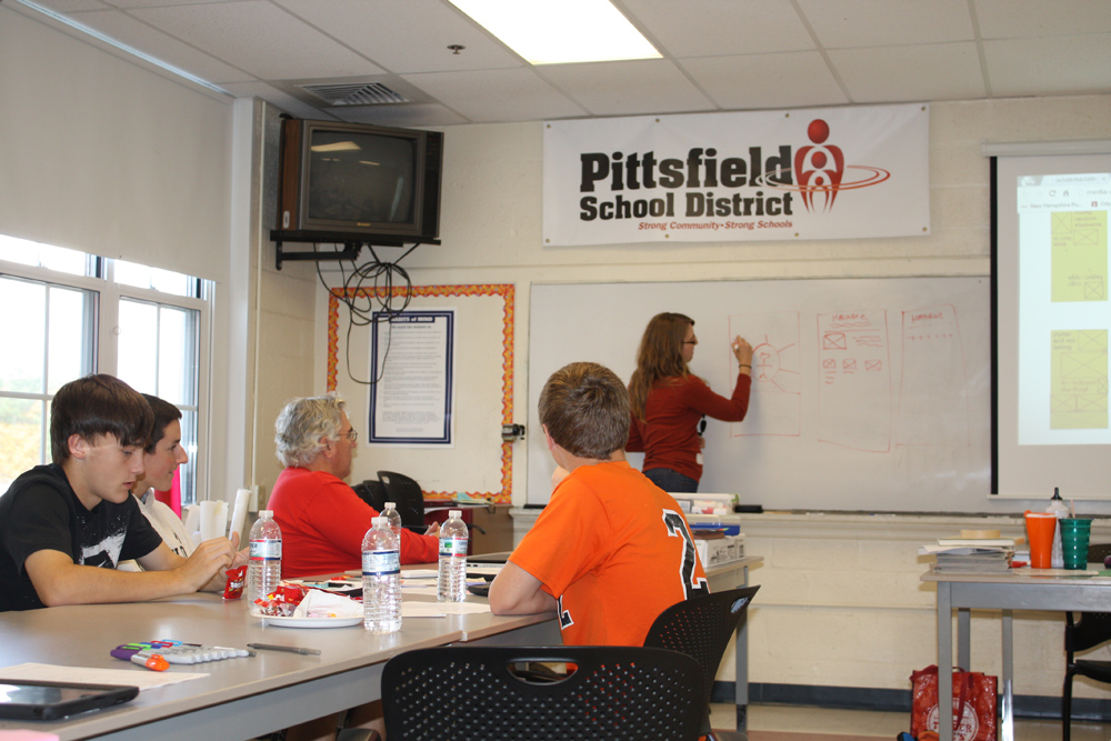
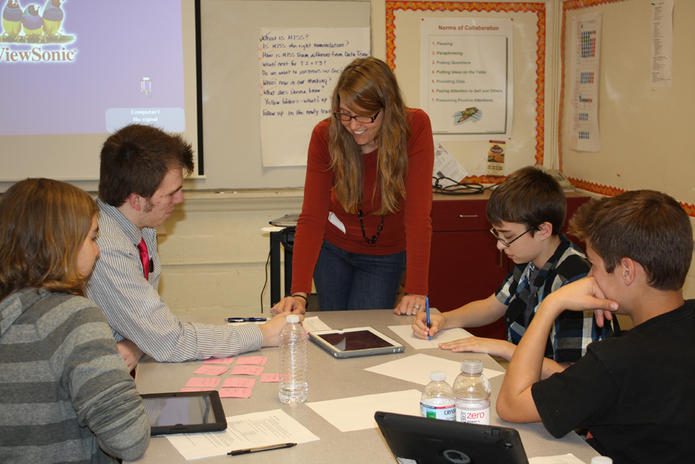
We worked out a two-day workshop that would be presented to both teachers and students. Day One would be the teacher workshop, and Day Two would be the student workshop, with teachers who participated during Day One having the option to return later in the day on Day Two to observe the students working. Both days would address elements related to crafting a story, doing proper research, sourcing data, and of course, the actual design of the infographics, including an overview of online infographic design tools.
The proposal was approved during the summer, and I was super excited. I started thinking about curriculum right away, but as most things seem to go in my life these days, I didn’t get a chance to formally sit down and develop a plan until the week before the workshop. (If it weren’t for last minutes, there’d be no minutes, right?) It was a little nerve-racking, and I’d be lying if I said I wasn’t still working on putting the finishing touches on datasets the night before the first day of the workshop.
My overall plan was to give participants datasets to use as a framework to create an infographic. This eliminated the need to do research and acquire data at the actual workshop, which can be time-consuming. What I didn’t quite anticipate was how time-consuming creating these datasets would be for me. I’m typically given the data and stats I need to tell a story and create the infographic. Man, tracking down compelling data that can be strung together to tell a story can be tough! (And, I now firmly believe, coming up with the dataset to begin with also would be a great exercise for students during an actual school project.)
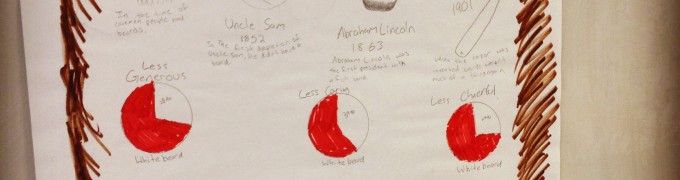
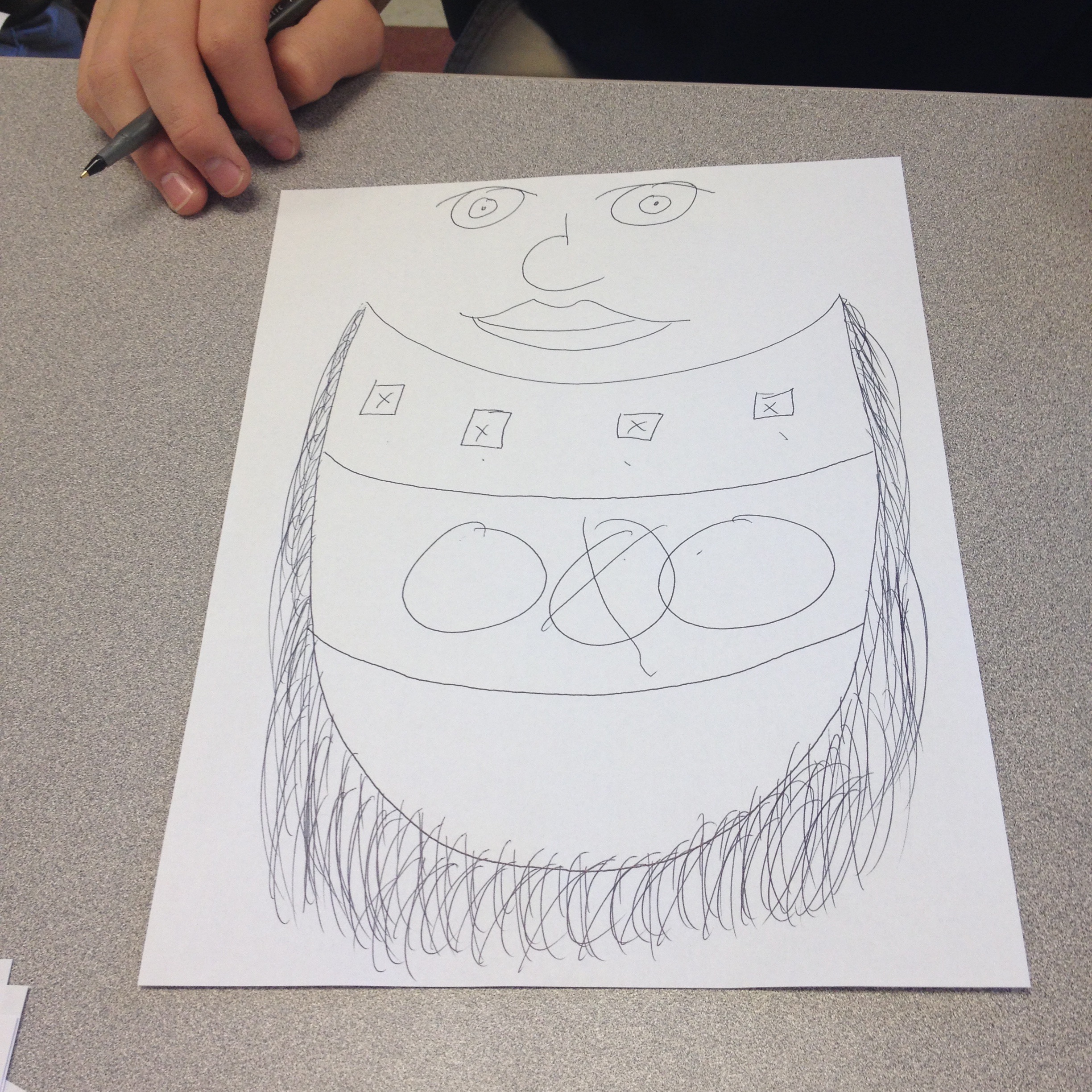
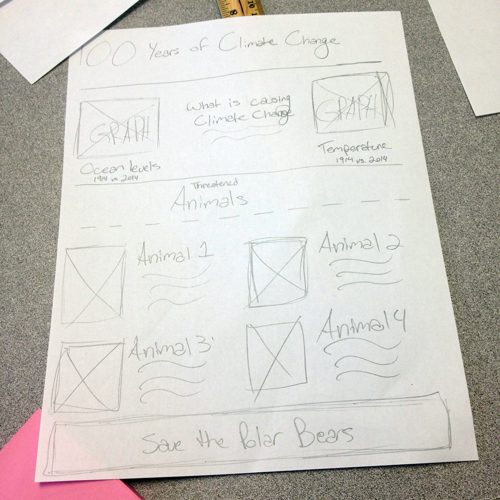
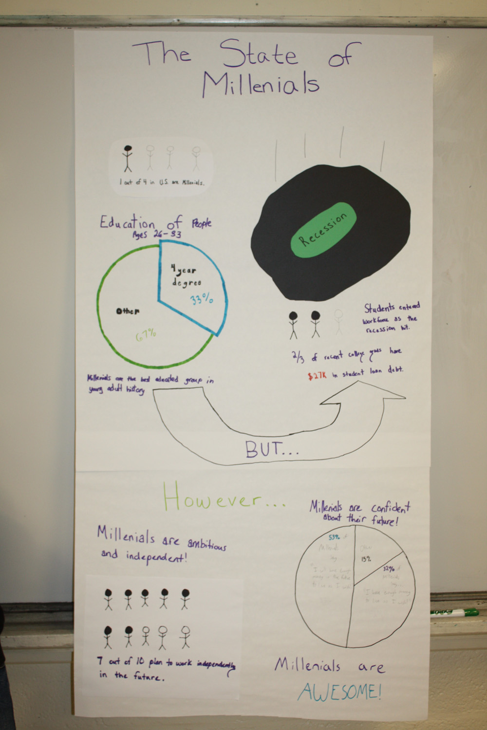
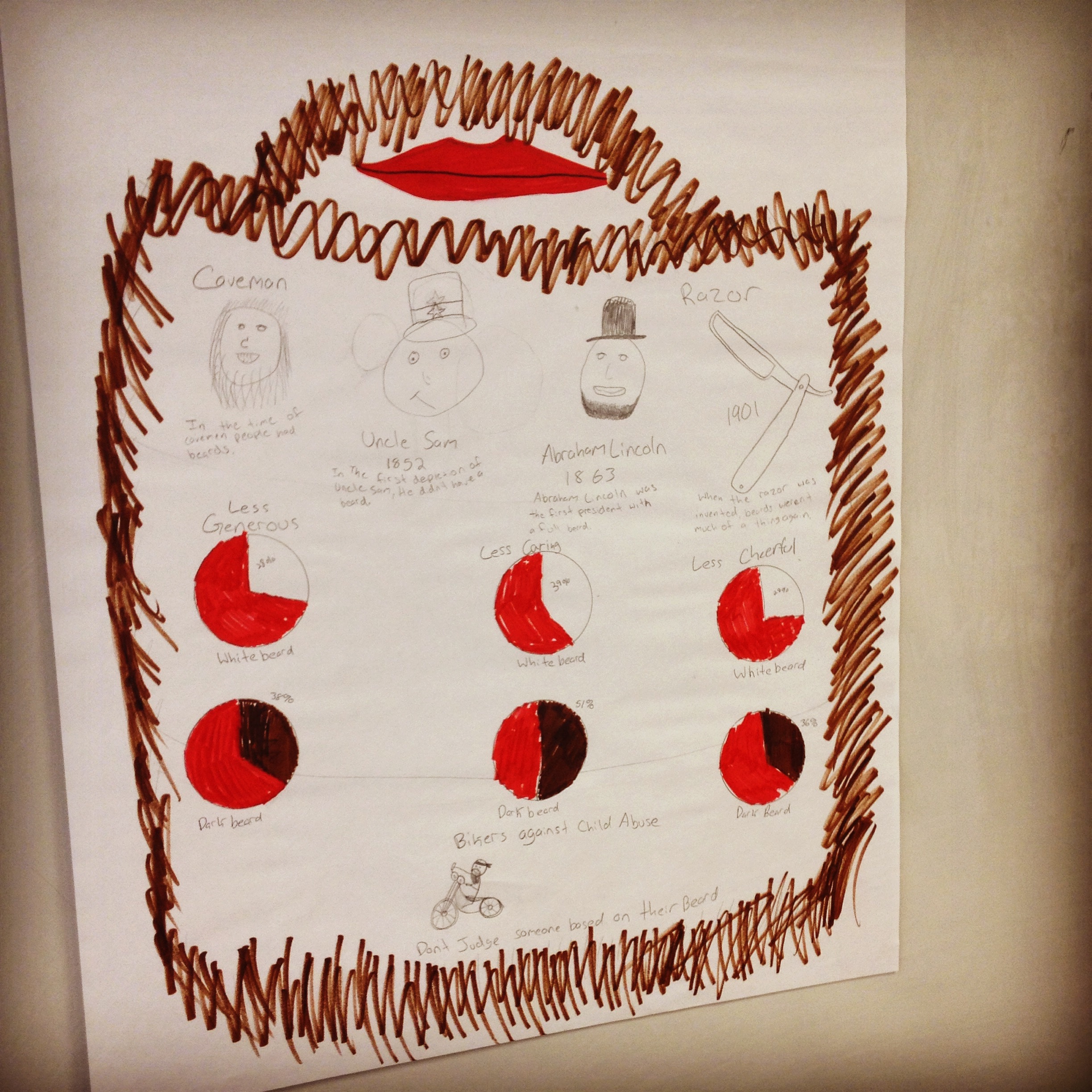
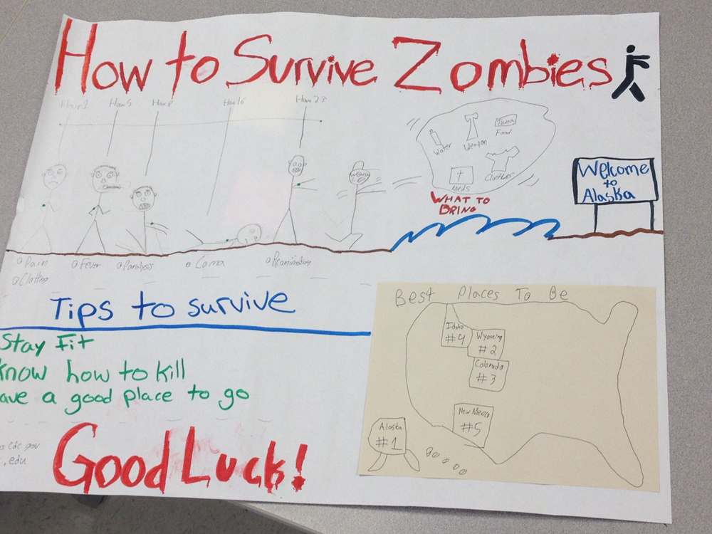
And then there was the question of what topics to choose. Data and stats can be kind of dry, so I wanted to choose stuff the students might enjoy but that I could also find some good data for without spending hours searching. I chose a couple topics near and dear to my heart (climate change and electric cars), added a topic I thought might be near and dear to their hearts (millenials), and then threw in two ridiculous topics (zombies and beards, of course) for good measure. In hindsight, I think I probably should have chosen more ridiculous topics because they were a big hit. Seriously, who doesn’t want to make an infographic on zombies or beards?
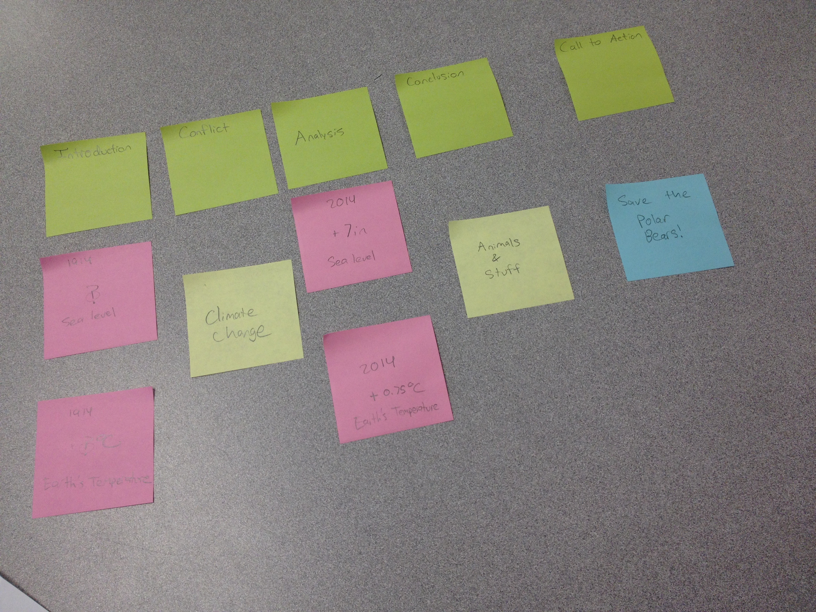
Even though they were time-consuming, the datasets proved to be a great framework to talk about doing research, the reliability of sources, and crafting a story. I was amazed both days by the stories that teachers and students found in the data, as well as the clever strategies they came up with to help develop those stories. One student team devised a super simple Post-it note system to help them organize the data and determine where there were holes. (Save the polar bears!)
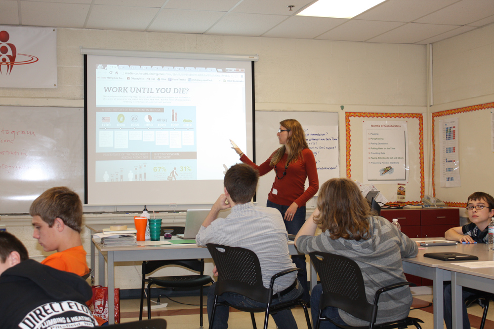
Both days featured a crash course on design that encompassed the basics of color, typefaces and layout. And let me tell you, it is HARD to pare down those subjects to something that takes less than an hour. The crowd favorite from that part of the workshop was the “What Not to Do” section, where I showed a series of bad infographics. And let me tell you, there are PLENTY of them out there. Thankfully, there are also several Tumblr accounts devoted to them, so you can find a whole bunch of examples of what not to do in one place. Here’s one of my favorites. (You’re welcome.)
I was really impressed by how quickly both the teachers and students picked up the design stuff. The students groups came up with some great layouts that were very different from each other, as you can see below (beards on the left, climate change on the right).
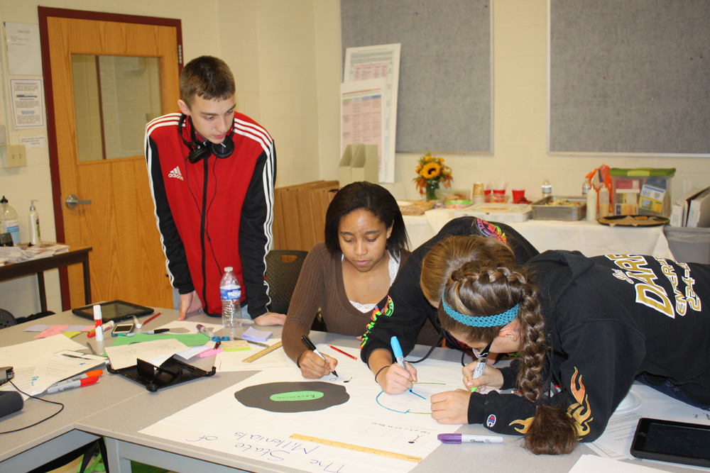
While the teachers ultimately created their infographics using online tools, we decided it made more sense to have the students create theirs by hand using manipulatives (which I learned is education-speak for markers, scissors, construction paper, glue and other things you “manipulate” with your hands) so that more students could participate at once (instead of just one student from each group designing on the computer). Unfortunately, that meant the students had a limited color palette and couldn’t address typography issues in the design, but it was a good solution to simplify things for the limited time we had. The plan is that when the students create infographics in the future, they’ll learn how to design them on the computer with the help of the teachers who also took the workshop. (Teach the teachers! Multiplicative knowledge!)
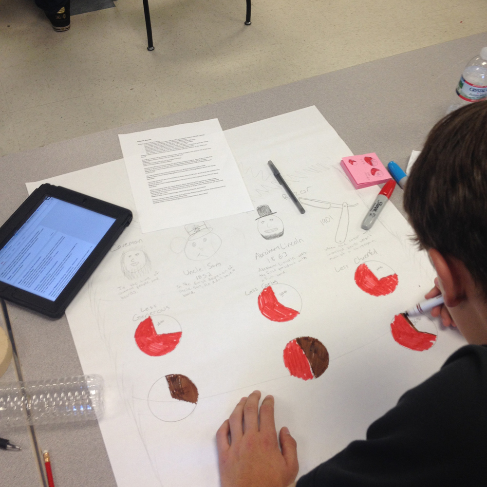
Just like with the wireframes, it was really awesome to see the different final infographic designs the students ultimately came up with.
I feel super lucky that I was asked to do this workshop, as I think I learned just as much as the teachers and students did. It really was a fantastic two days. (Thanks, Jenny!) I hope I have the chance to present the workshop again sometime!
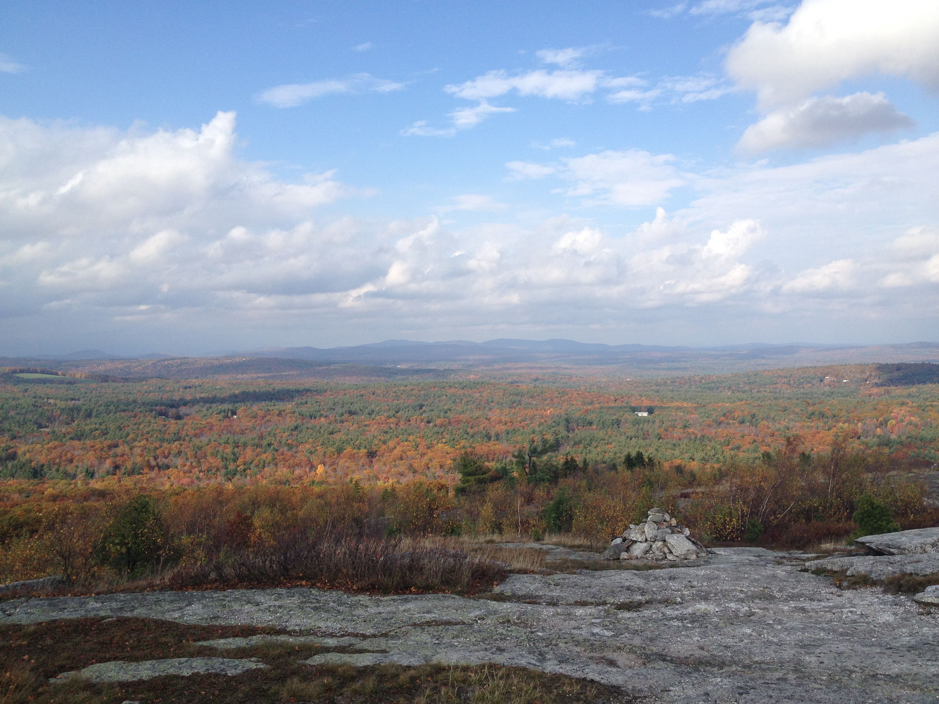
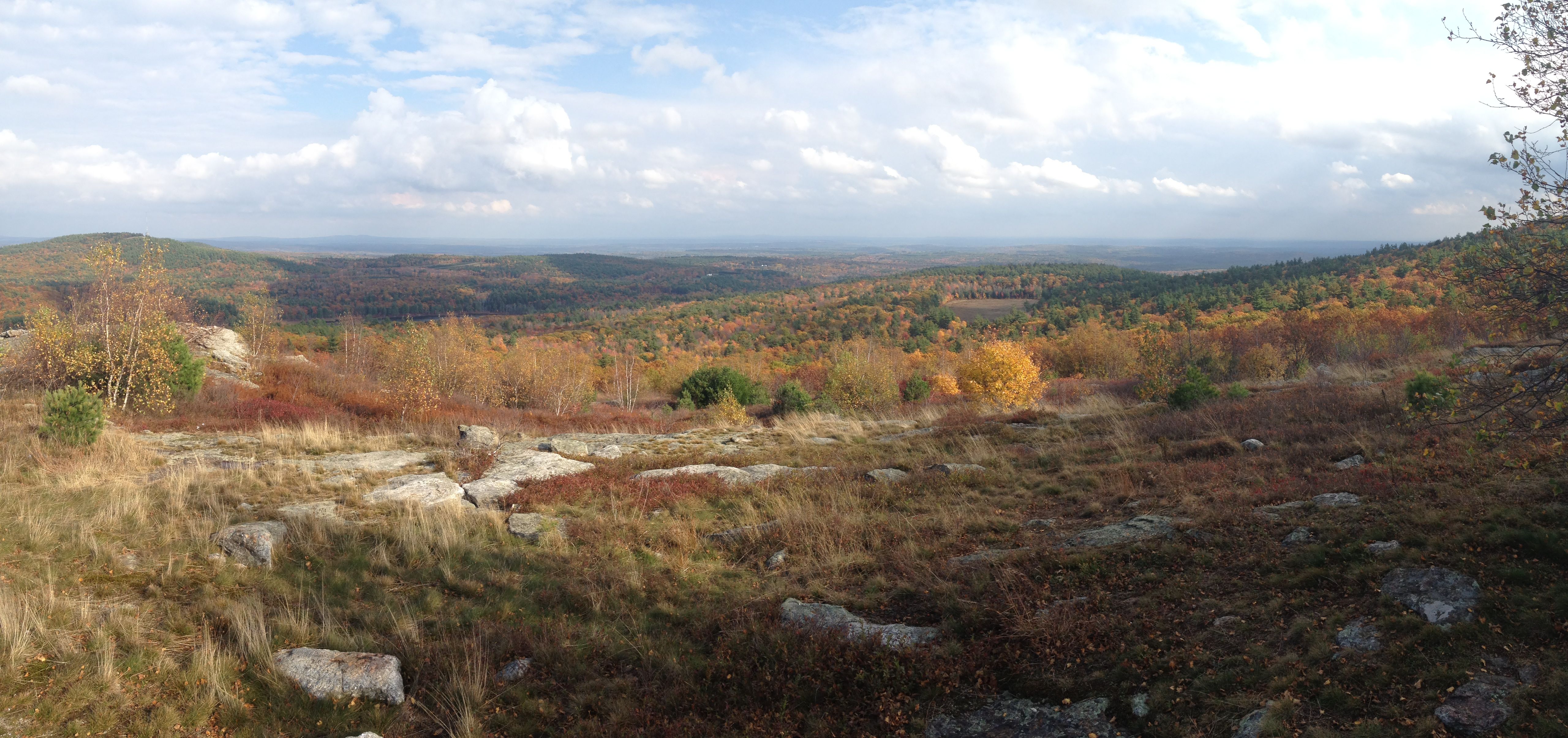
And lest you think that I went all the way up to New Hampshire and didn’t get to enjoy some of the fall colors, I did manage to get out and go for a hike. (All work and no play makes Homer something something…..) I leave you with a few choice parting images. Enjoy!

Leave a Comment
Let us know your thoughts on this post but remember to place nicely folks!